None of what follows needs design training. It's mostly about making a few decisions on purpose instead of accepting whatever the defaults are.
Pick three font sizes and stop
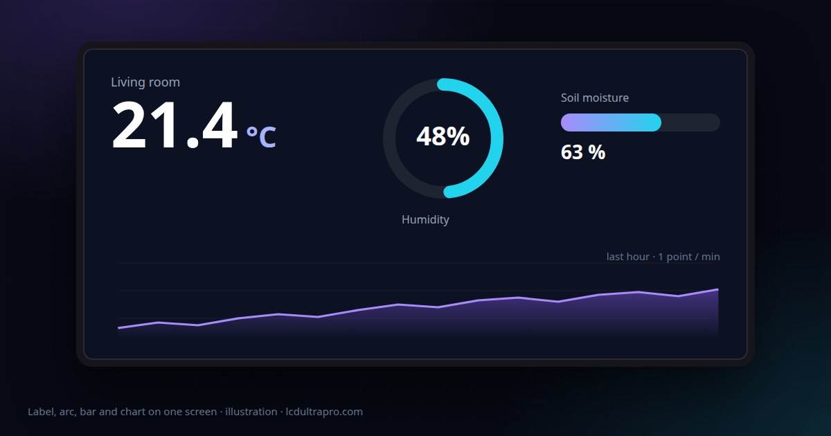
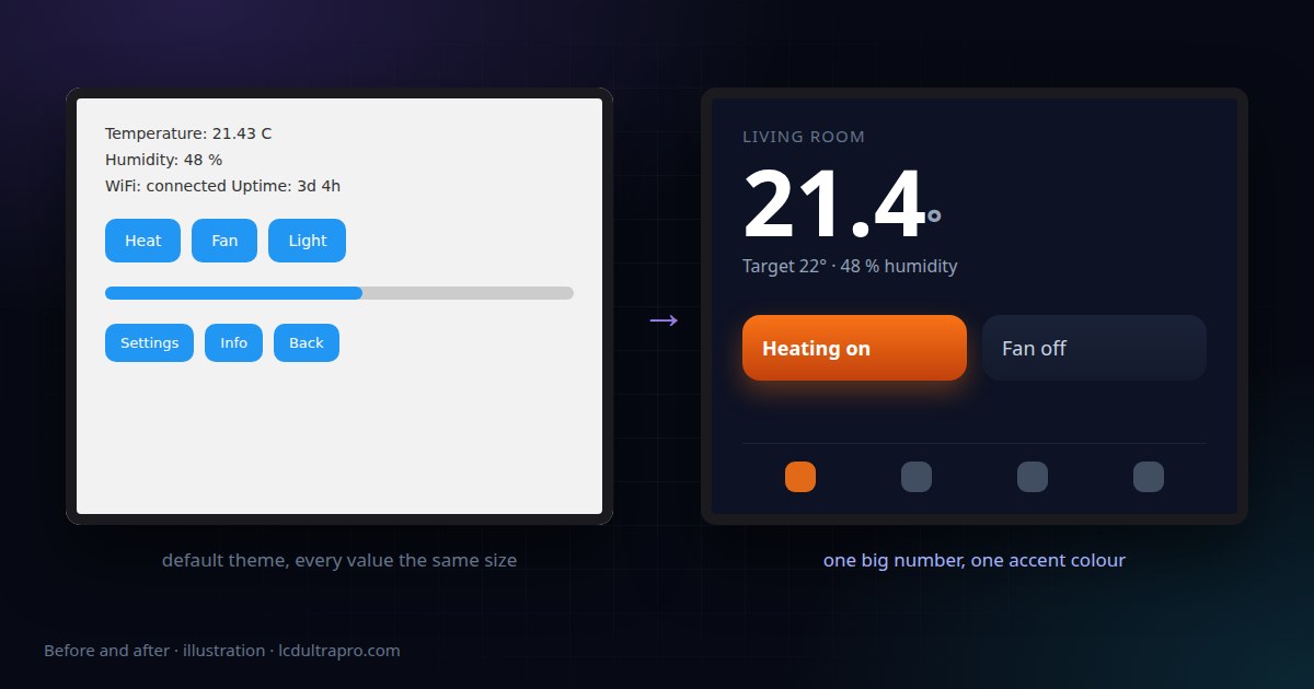
The fastest way to make a screen look considered is to use fewer sizes, used consistently. One big size for the value that matters, one for normal text, one small for labels and units. On a 320×240 screen something like 36, 18 and 12 works. On an 800×480 board you can roughly double those.
Then use them the same way everywhere. If the temperature is 36 on the home screen, it's 36 on the detail screen too. Inconsistency is what makes a UI feel thrown together, much more than any single choice.
Go dark, and choose one accent
Most small displays look better with a dark background. A big white area is glaring in a dim room and lights up the wall behind it at night. A near-black background with light text looks deliberate and is much easier to live with. Not pure black, though. A very dark blue or grey gives you room to put slightly lighter cards on top.
Then pick one accent colour and use it only for things that are on, active or need attention. If every button is bright blue, nothing stands out. If only the heating button turns orange when it's running, the screen tells you something at a glance.
Remove things
Small screens punish clutter more than big ones. Before adding a widget, ask what decision the person standing in front of it will make with it. A thermostat needs the current temperature, the target and a way to change it. The humidity, the Wi-Fi status and the uptime can live on a second screen that nobody visits every day.
Empty space isn't wasted space. Margins of 12 to 16 pixels around the edge and between groups make a 2.8 inch screen feel calm instead of cramped.
Group with cards, not lines
Put related things in a container with a slightly lighter background and rounded corners, and leave a gap between containers. That reads as structure far better than divider lines. A subtle vertical gradient on the card is enough to give it depth. Heavy shadows mostly look muddy on small LCDs.
Check contrast on the real panel
Colours that look fine on your monitor can disappear on a cheap TN panel viewed slightly from the side. Mid-grey text on a dark grey card is the usual casualty. If a label is important, give it real contrast. If it's not important, ask whether it needs to be there at all.
The only reliable test is the actual display. In LCD Ultra Pro, USB Live mirrors the canvas onto the board while you edit, on the boards that support it, which makes this a quick loop instead of a compile-and-flash cycle. On other boards, export and upload a draft early, before you've built every screen around colours you haven't seen on the hardware.
Icons over words, where it's obvious
A Wi-Fi symbol, a gear for settings and a house for home are understood by everyone and take a fraction of the space of the words. Use them for navigation and status. For actions with consequences, like turning off a heater, keep a word on the button. Nobody should have to guess what a button does when it switches mains power.
What the editor helps with
LCD Ultra Pro runs the real LVGL engine, so what you see while designing is what the board draws. Montserrat comes in sizes from 10 up to 46, gradients, corner radius, opacity and letter spacing are ordinary properties, and there are ready-made components like headers, navigation bars, cards and settings screens that already follow a consistent style. If your text has accented letters, the export switches to an extended version of the font automatically and only includes the sizes you actually used, so a Hungarian or German UI doesn't cost you flash for nothing. The demo projects are a reasonable place to start if a blank canvas is the hardest part.
One test before you call a screen done: stand two metres back and squint. Whatever you can still make out is what the screen is really saying. If that isn't the thing that matters most, change the sizes until it is.
- #lvgl design
- #esp32 ui
- #embedded ui design
- #lvgl theme
- #lcd ultra pro